
Subscriber Onboarding · Growth · 0 → 1
“How it works” in Guided Onboarding
Bringing product understanding into onboarding so more new customers reach value faster.
- Problem:
- When this work began, onboarding was posting negative net adds month over month. Sentiment wise, new trial users signed up believing the product could help, but many never saw enough value to keep going. Workflow wise, the existing onboarding moved new customers straight from signup into setup tasks, before the product had earned enough understanding or trust, which exacerbated the abandon rate.
- Design process:
- Research partnership and synthesis → 15-person cross-functional design workshop → concept and Figma prototype → 8-person concept validation → design lock and a staged A/B launch.
- Solution scope:
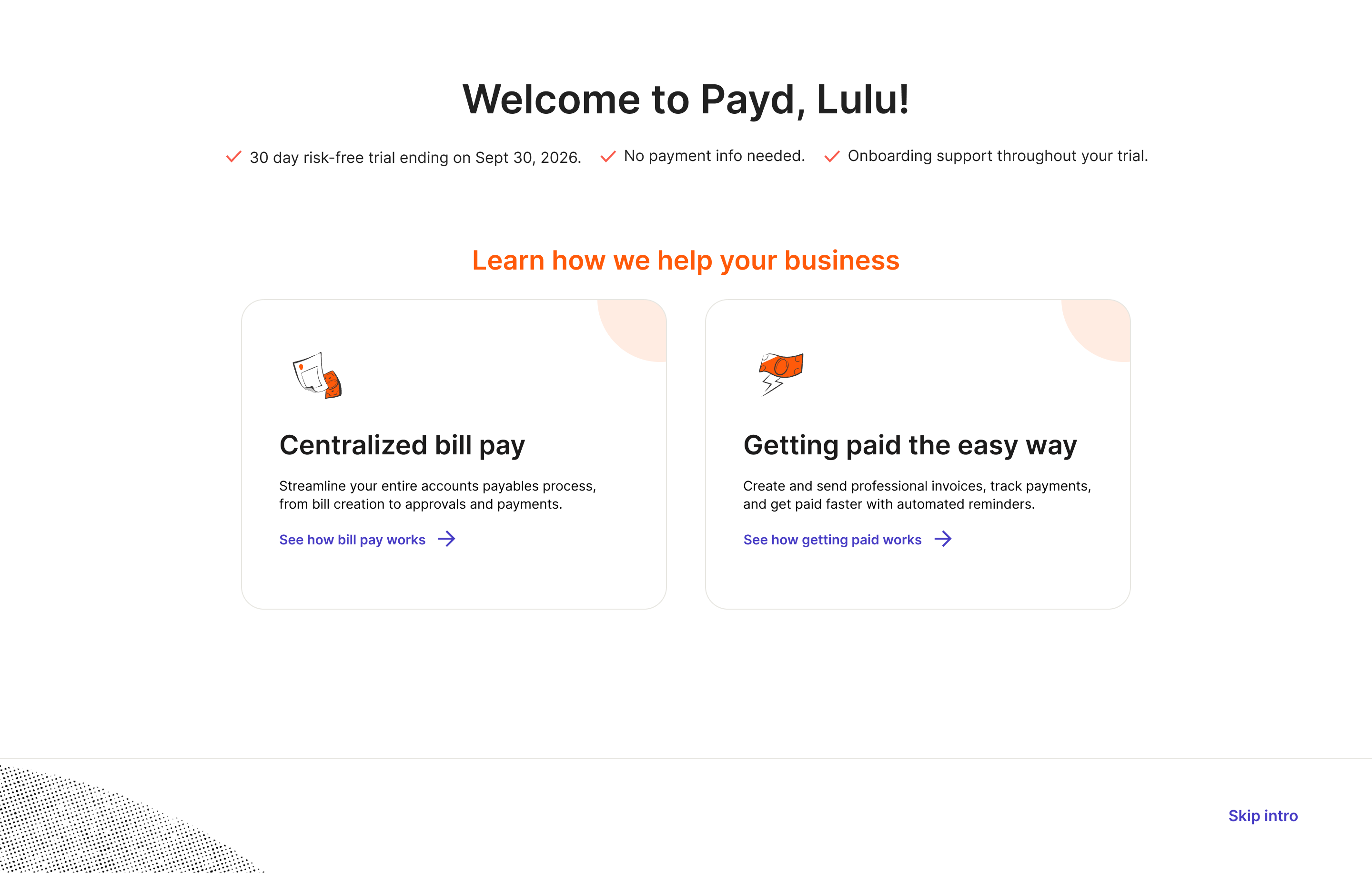
- A skippable, full-screen "How it Works" walkthrough near the top of AP/AR onboarding, personalized by the user's primary goal: paying bills, getting paid, or exploring.
- Research:
- ~12 moderated customer interviews, dozens of recorded sales discovery calls, an 8-person moderated concept test.
- Hypothesis:
- By adding a concise educational walkthrough in onboarding before set up tasks improves comprehension and lifts downstream setup and activation.
- Team:
- 1 product manager, 1 product designer, 2 researchers, 1 content designer, 2 engineers.
01Context & problem
The existing onboarding moved new customers straight from signup into setup tasks before the product had earned enough understanding or trust. In legacy set up step, 50% of users clicked at least one tile, 39.2% clicked more than one, yet fewer than 7% completed all AP setup tasks during trial. Sync rate, one of the critical retention signals, sat below 12%. Customers were exploring, but not confidently committing to the actions that mattered most.
Our hunch was that customers signed up because they believed the platform could help, but many didn't yet understand how it would fit into their workflow, what value they'd get first, or where to start.
That framing shaped the design challenge: create a first-run experience that teaches just enough, captures intent, and guides people toward the right next step without overwhelming them.
02Three ways to find out why
Talk to customers
Sit in 12 moderated trial user interviews, synthesized independently
Sales calls
Listened to dozens of recorded sales calls
Cross-functional workshop
Organized and led a 15 people working session to create onboarding flow concepts
I began by partnering with our researcher on the trial onboarding research plan. The goal was to deeply understand who new customers were, what triggered them to sign up, what they expected the platform to solve, and what barriers kept them from continuing beyond the first 30 days. Key questions include:
- What pain or business event triggered the search for a solution?
- How customers worked before adopting the platform?
- What "value" meant to them during evaluation?
- Where they got stuck, hesitated, or dropped off?
- How they decided whether the platform was worth paying for?
We then paired that with dozens of recorded sales qualification and discovery calls, the theme of “A desire for education” started to emerge besides other findings.
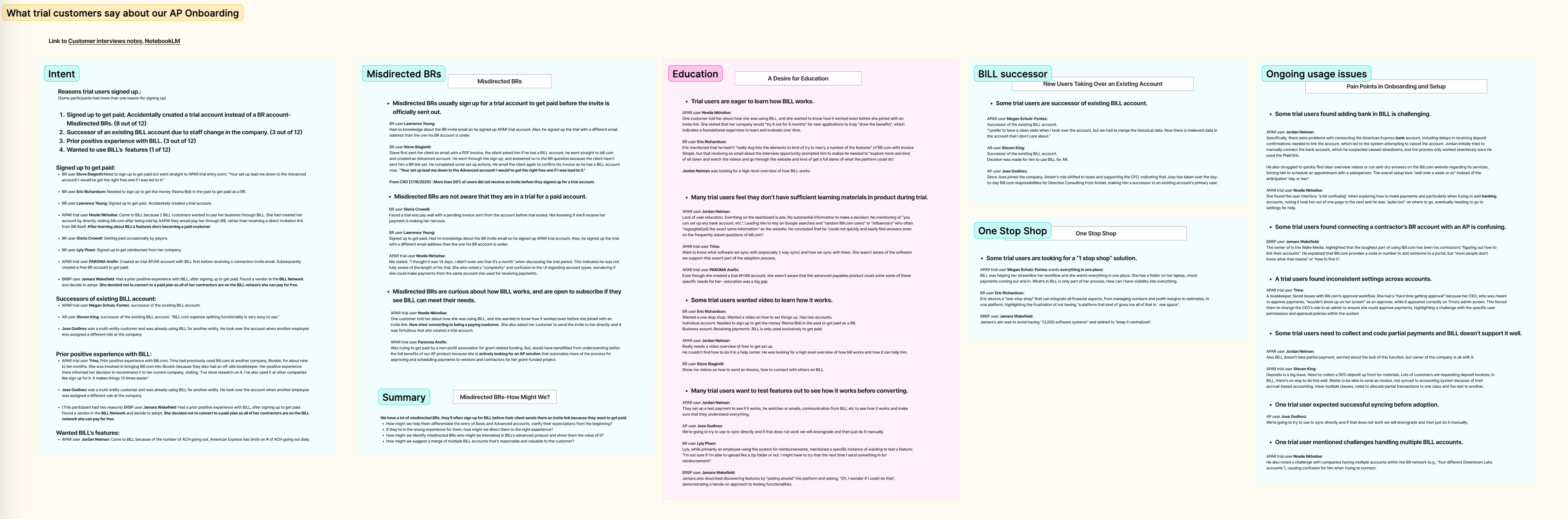
One participant heard about the product through a connection, so she wanted to know how it worked even before she received an invite link. She said her company would "try it out for 6 months" for new applications to truly "draw the benefits", which indicates a foundational eagerness to learn and evaluate over time.
Another wanted to know what software we sync with (especially 2-way sync) and how we sync with them. She wasn't aware of the software we support, a key question for her to adopt us.
A third mentioned that even though she created a trial account, she wasn't aware that the advanced payables product could solve these specific needs for her — education was a big gap.
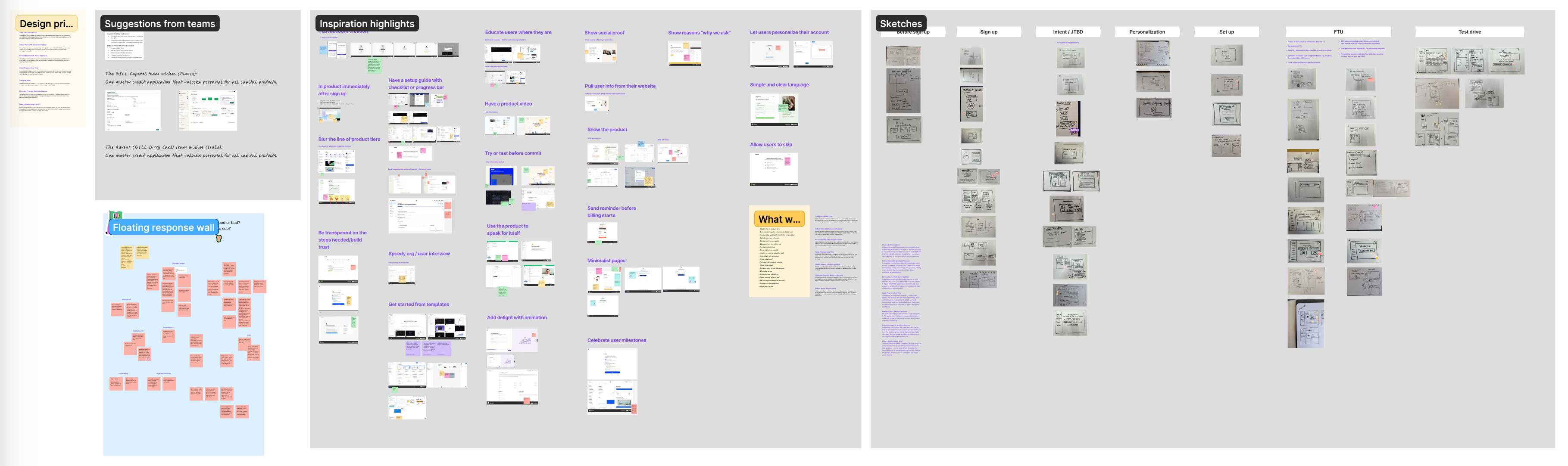
We then organized a design-led workshop, gathering 15 designers, researchers, sales, marketing in one room for 2 full days to understand user needs and create solution concepts.
03Insights & roadmap prioritization
The research surfaced many pain points, but one theme stood out: customers often believed the platform could help them, yet they were missing the "how." The confusion was about how the platform worked, how it mapped to their existing process, and how to judge whether it was the right fit.
Two truths were especially important. First, most new AP customers had their “Aha” moment when talking to sales and watching a hero workflow, then they are convinced that the platform was a good solution. Second, previous onboarding improvements had lifted setup completion in the short term, but those gains hadn't translated into sustained activation and conversion across later cohorts, which helped us avoid optimizing only for shallow task completion.
From there, I helped the team prioritize "lack of product knowledge and education" as the first roadmap item, because it had the best balance of impact, speed, and risk. By solving general unfamiliarity with the platform over adding more setup-specific guidance in v1, we will be able to test whether foundational education would unlock stronger activation.
04Final design & user tests
In practical terms, the design did what a good salesperson or implementation partner does in a live conversation: explain the product in the customer's language before asking them to configure it.
You can walk the flow yourself in the live prototype at the top of this page.
After I created the concept, I partnered with our researcher to test it with 8 new customers. The strongest signal was that customers generally understood the intent of the experience. Several read it as a tutorial or product overview and said it looked simple, useful, and approachable, something they could imagine using as a refresher during their first few weeks with the platform.
The test also surfaced important gaps:
- some users wanted a clearer bridge from the educational tour into setup
- some wanted deeper proof around integrations, security, payment methods, and cost
- some expected richer "see it in action" moments, such as a test account, video, or concrete examples
- a few labels and concepts felt too abstract or too marketing-led — one participant called out "Generate reminders with AI" as less clear than the plain-language "generate reminders"
The clearest signal on sequencing came straight from a participant who expected the tour to hand off directly into setup:
“Expected to see set up guide after 'how it works'.”
I used that feedback to sharpen the experience: keep the walkthrough lightweight, make the path back into setup clearer, improve the explanation of high-scrutiny areas like payments and trust, and ground the content in the real questions customers ask while evaluating.
05Design lock & pre-launch audit
As the concept moved toward launch, I shifted from exploration into design lock and pre-launch quality work.
Since "How it Works" touched multiple functions at once: Growth, engineering, AR, payments, customer marketing, content, and multi-product adoption. Before launch I aligned the flow across those stakeholders, resolved open questions in content and sequencing, and kept the v1 scope tight enough to ship and to learn from quickly.
06Key decisions & tradeoffs
Education before prescription. We prioritized familiarity with the platform over deeper setup guidance in v1, relying on the existing setup guide to carry the next phase.
Lightweight and skippable, not an interactive demo. A sandbox could have answered more detailed "show me" questions, but it would have been significantly more expensive to build. v1 tested whether a concise walkthrough alone could move understanding and behavior.
Personalize lightly. We captured primary intent and reordered the setup guide accordingly, but didn't ask a long series of qualification questions. This reduces both engineering scope and cognitive load.
Depth versus clarity. We deliberately didn't try to answer every downstream setup question here. Implementation specifics and trust-building moments around bank add or sync would need follow-on onboarding work.
07Outcome & impact
The feature launched in December 2025. The early readout showed the core idea was working. In January 2026, users who selected a tour completed setup at 5–7× the rate of users who skipped it, more than 83% of users who started the educational tour completed it, and learners booked Sales Connect calls at 1.4× the rate of skippers.
Just as importantly, the data invalidated a prior hypothesis. We had assumed some users skipped because they were power users ready to move quickly. Instead, users who skipped "How it Works" were not only booking fewer sales calls but also setting up less often, which reframed skipping as a possible signal of under-engagement, not expertise.
For me, this project reinforced a principle I care about in onboarding design: before users can trust a workflow, they need to understand the promise behind it. "How it Works" didn't try to solve every onboarding problem at once, it solved the earlier, more foundational problem of helping customers understand what the platform does, why it matters, and where to begin. That made it a strong first roadmap investment: it created measurable lift, captured intent we previously lacked, and established a clearer foundation for the more prescriptive guided setup work that could come next.